Sup guys.
I've always had a soft spot for writing that feels alive. It's something you just can't capture or come across on social media platforms with character limits.
At 4 AM JST, after a long hiatus from this raw emotion, I decided it was time for my debut on Paragraph.
Since it's my first post, I'd like to start with a brief introduction.
My name is Eko, which, of course, isn't my real name. I'm the creative director at Senspace, a product studio based in Tokyo that creates new values, experiences, and entertainment. (I don’t usually mention this, but I'm also a co-founder there.) Senspace is also a member of Seed Club's SC06.
I was a founding member of the Japanese edition of the world’s leading culture media HYPEBEAST and worked as a senior editor there. Since going freelance in 2019, I've worked with domestic and international streetwear brands or media like A BATHING APE®️, atmos, BEAMS, GQ, LA 2028, Nike, OFF-WHITE, THE NORTH FACE, UNDEFEATED, UNION, UNITED ARROWS and XLARGE®️︎ on visual and content production.
Enough about me. In my first article, I’d like to discuss the design background of the OG NFT released after the first collection of Senspace's /ball.
You know NFTs tend to prioritize utility, so their artistic side often doesn’t get the spotlight. But design is an essential element in expressing and accelerating culture, and without good design, culture wouldn't be as widely accepted.
As I mentioned, my roots are in editing, not in being an artist or designer. However, my close interactions with many creators have given me unique insights that I’m proud to share.
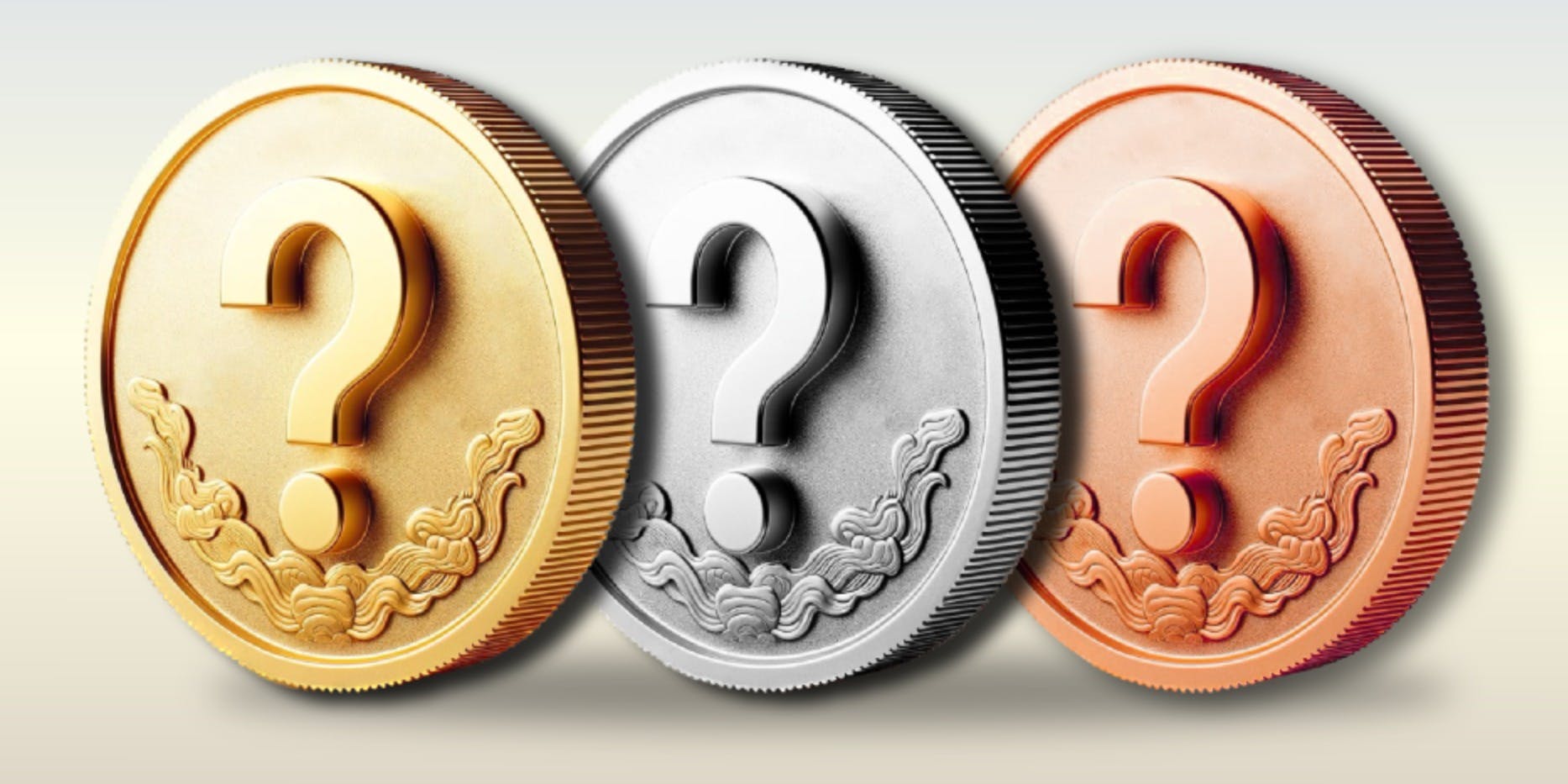
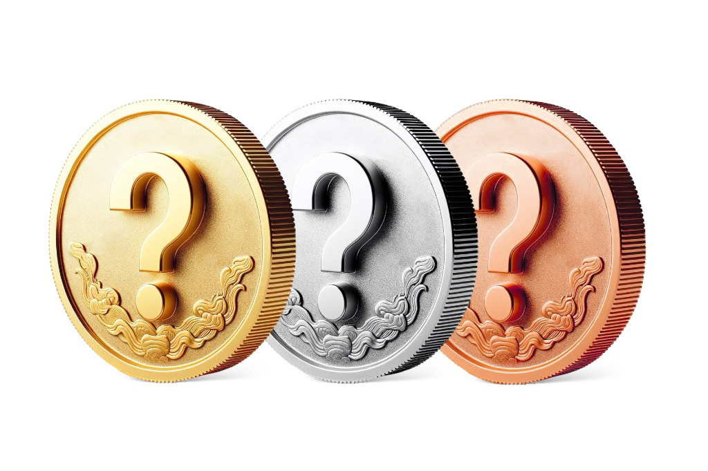
For the OG NFT, I wanted to honor Japan’s unique capsule toy culture, Gachapon, marking a fantastic start for /ball.
I focused on commemorative medals. From hosting international tournaments to significant anniversaries, humanity has always marked historical highlights with medals. This is no exception in Japan, with events like the Tokyo Olympics, the Shinkansen launch, the Emperor's accession, and the completion of the National Stadium.


Commemorative medals are highly sought after by collectors, sharing much in common with NFTs. Gachapon machines also operate by inserting a medal (technically a coin), highlighting their affinity.
The design focuses more on being iconic than complex. The key graphic, a question mark(?), stems from its origin in Latin "quaestio," where it was formed by stacking the first and last letters vertically. Question marks are incredibly symbolic yet elusive, sparking imagination.

Supporting the question mark in the design is the Tokiwagi(常磐木), a type of evergreen tree in Japan like pines or cedars, cherished in celebrations and ceremonies, and even featured on Japanese coins.
The pine tree, a representative Tokiwagi, is said to have a lifespan of more than 1,000 years, and its leaves are strong enough not to change color even in severe cold weather. The word "Tokiwa(常盤)" is also derived from the word "everlasting rock," which in turn means eternal and unchanging.

Drawing from these cultural roots and the enduring nature of Tokiwagi, we aim to symbolize the strength and vitality of the Web3 community, enduring through countless winters.
That’s the backstory of /ball’s OG NFT—a true reflection of the culture-respecting essence of Senspace.
I hope this offers a fresh perspective on NFTs beyond their utility.
Eko
Creative Director of Senspace
Warpcast: @ekosystem
/ball: Warpcast
(P.S. For some reason, I got shadowbanned on Warpcast. If this story resonates with you, feel free to share it with your followers.)
(以下、日本語)
昔から“血が通った文章”が好きだった。それは文字数制限のあるSNSでは表現することも、出逢うこともできないものだ。
久しぶりにその感情と真摯に向き合う日本時間の午前4時、俺は「Paragraph」のデビューを決めた。
個人的に積もる話はあるのだが、初回ということもあり、冒頭に簡単な自己紹介を添えておきたい。
名前は、Eko。もちろん、本名ではない。東京を拠点に新たな価値や体験、エンターテイメントを創造するプロダクトスタジオ「Senspace」でクリエイティブディレクターを担当している。(あまり口外することはないが、実は共同創設者でもある)
世界最大級のカルチャーメディア「HYPEBEAST」の日本版に創業メンバーとして加入し、同社でシニアエディターを担当。2019年の独立後はフリーランスのエディターとして活動し、「A BATHING APE®️︎」「atmos」「BEAMS」「GQ」「LA 2028」「Nike」「OFF-WHITE」「THE NORTH FACE」「UNDEFEATED」「UNION」「UNITED ARROWS」「XLARGE®️︎」など、国内外のストリートアカウントのビジュアルおよびコンテンツ制作に携わってきた。
鬱陶しい自分語りはこのあたりにしておき、最初の記事では「Senspace」が運営する「/ball」の1st コレクション後にリリースした“OG NFT”のデザイン背景を解説したい。
NFTは、その実用性が優先される傾向にあるため、アート性にスポットライトが当たることは少ない。だが、デザインは文化を表現し、文化を加速させるための必須要素であり、良いデザインなくして文化が多勢に受け入れられることはないと考えている。
先述のとおり、俺はエディターをルーツとする人間であるため、アーティストやデザイナーとしてのキャリアはない。しかし、編集者として数々のクリエイターと近く寄り添ってきた経験があるからこそできるアウトプットがあると自負している。
さて、このOG NFTは、日本独自のトイ文化であるガチャポンにオマージュを捧げた「/ball」の素晴らしいスタートを祝福するものと位置付けて、コンセプトメイキングをスタートした。
そこで着目したのが、記念メダルである。
国際大会の開催、シンボリックな建築物の柿落とし、アニバーサリーなど、人類は歴史上のハイライトとなる瞬間に必ず記念メダルを発表してきた。それは日本でも例外ではなく、東京五輪、新幹線の開通、天皇御即位、国立競技場の完成など、当てはまる例を挙げれば枚挙にいとまがない。
こうした記念メダルは、熱心なコレクターたちの収集の的となっており、コレクタブルとして所有するものとして、NFTとも大きな共通項がある。また、ガチャポンも筐体にメダル(実際は硬貨だが)を入れてプレイすることから、その親和性にも着目し、「/ball」のまたとないローンチの瞬間を記録するべく、記念メダルのモチーフを採用することにした。
デザインは、複雑さよりもアイコニックさに重心を置く方向性で進めた。キーとなるグラフィックは、「What's in the Ball?」のスローガンやプロジェクトロゴとして、1stコレクションを成功に導いた「?」のアイコン以外、選択肢はなかった。
疑問符(クエスチョンマーク)の起源は、ラテン語で“質問”を意味する“quaestio”の最初と最後の文字を縦組みにしたこととされている。言わずもがな、俺たちが当たり前のように使用している疑問符は、非常にシンボリックでありながら、どこか掴みどころがなく、イマジネーションの余白を感じさせる不思議な魅力がある。
その疑問符を下から支えるように配置されているのが、常磐木である。常磐木とは、年中葉が緑色で枯れることのない常緑樹を指す。日本では松や杉が常緑樹に該当し、これらの木々は日本のお正月や冠婚葬祭など、おめでたい瞬間に重宝されてきた。同時に、常磐木は日本の硬貨(十円青銅貨幣)にも刻まれていることで広く知られており、常磐木は文化や生活に深く根ざしている。
常磐木の代表格である松の寿命は千年以上と言われており、厳しい寒さの中でも葉の色を変えることのない強さがある。また、常磐という言葉は、常に変わることのない岩を語源に持つことから、転じて永久不変なことを指す。
こうした語源や日本の文化に着想を得て、幾度となく冬を経験しては乗り越えてきたWeb3の力強さと、常磐木の生命力を重ね合わせ、コインデザインにはWeb3クリエイターたちのイマジネーションを恒久的に支えてほしいという思いを込めた。
以上が「/ball」のOG NFTのデザイン背景である。
東京を拠点とし、文化に敬意を示す「Senspace」らしいアイテムだからこそ、1人でも多くの人に実用性とはまた異なるNFTの一面を感じ取ってもらえたら幸いである。
(追記)
Warpcastではなぜかシャドウバン扱いになってしまった。もしストーリーに共感してくれる仲間がいたら、この記事をみんなのフォロワーにシェアしてほしい。

Collect this post as an NFT.
Renowned Creative Director @ekosystem, also known as Eko, has made a debut on Paragraph. In this inaugural blog post, Eko discusses the design thinking behind Senspace's OG NFT, an homage to Japan's unique Gachapon culture. The design aims to symbolize the strength and vitality of the Web3 community.