


Case Study: This week, @dave_krugman made 21.95 ETH, Here is How:
He could have made even more !
Nahiko
3 min read·
Estimated read time: 8 minutes 10 seconds.
This week, @dave_krugman dropped his latest project making 21.95 ETH

Here are 5 key takeaways for artists and collectors 🧵 (Case Study)
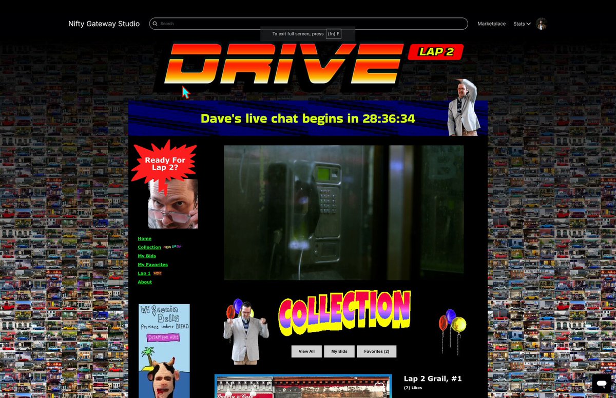
What a masterclass by Dave, the website, the tweets, the videos, the GIFs !

We poured absolutely everything into the design and user experience of DRIVE // LAP 2. I worked to evoke the early internet I grew up with. Geocities, GIFs, banner ads that link to the collections of @SamSpratt, @toadswiback and @ALIENQUEENNFT, a live stream function with a full…
 230
230
You can feel the passion poured into the project to embark the collectors in his world. I loved it !

A true masterclass from Dave on this drop
The marketing material is just as good, if not better than the art itself
And I don’t mean that as a slight to the art! I haven’t seen this level of marketing put into a drop in a long time, maybe ever


The marketing material is just as good, if not better than the art itself
And I don’t mean that as a slight to the art! I haven’t seen this level of marketing put into a drop in a long time, maybe ever

Thank you so much to everyone who has been sharing, commenting, texting, talking, laughing, and saying kind things to me about DRIVE // LAP 2. We poured our hearts into this one and I am so happy and proud of our extended team. I've really never had this much fun with art before,…

Many collectors hailed Dave's branding for the drop, and I don't think I would've learned about the drop without this buzz and Deeze's tweet.

This reminded me of how @marc_louvion launches his SaaS products with viral videos. (he described his method here)

Nowadays you rarely see a music piece being released without a music video, and there's a good reason for it:

But why don't we see this from visual art ? Dave showed how impactful this can be for us too.
While the minting website was on-par with the amazing branding, from a UX POV I think it's far from ideal.

I showed it to my wife and she said:
There are way too many items on the screen
It's true, In fact the website breaks at least 4 UX laws:
Fitts's Law: Make it easy to select things (make them BIG)
Hick's law: Too much choice is.. well... too much
Similarity Law: Visually similar elements will be perceived as "not unique"
Miller's Law: The average person can only keep 7 (plus or minus 2) items in their working memory.
What it means is:
There are too many items
They are too small
They all look the same (from afar of course)
They are hard to relate to (because of all this)
You can look at the difference between Dave's minting page and ACK's (Broken Keys) minting page.

The key takeaways here to improve mint pages are:
Keep the artworks big enough so people can feel like they can touch it (see my thread on how to create "graspable" 3D objects:
Secret #2: Make it holdable
What do I mean ?
A picture is worth a thousand words:
Let the artworks breathe, don't add too much on top of it at the risk of making every artwork look "the same":

Look at how similar the two tokens end up looking because of the "SOLD" banner and the artworks being so small (this is heavily zoomed btw) Last but not least keep the background shenanigans minimal. The background being so charged makes it hard to know where to focus your attention (especially since the background itself is also the art, but it's not mintable, this is super confusing)

There were 91 (actually 58, per @redbeardnft, thanks for reaching out) unsold editions. There is no rule on edition numbers, and that's why I love these case studies.
For my current project (the build in public one), I don't know how many editions to sell. Right now I'm looking at 16, which might be too low (as discussed in a previous issue):

On the other hand, we can see that 300 seems to be too many.
I'm unsure if the issue stems from the UX problems (see above), the bear market, or other factors.
It seems artists have a key number to hit based on:
their following
their outreach
announcements interest
But calculating this is tough.
Instead, the best approach is to analyze similar artists' drops and addition numbers to make informed decisions, using real data from previous performances.
Okay, so why don't we do exactly that?
Let's compare Dave's drop with another drop by a very similar artist in terms of following. I named ACK (Alpha Centauri Kid) and his famous broken keys (initially 100 editions):

thank you ser, appreciate that a lot.
the piano collection is called "The Broken Keys" and will be a collection of 90-100, 1 of 1 piano scenes.
I won't be token gating them or anything as i am having them all start with a 0 eth reserve.
i've shared quite a lot of them but…
the piano collection is called "The Broken Keys" and will be a collection of 90-100, 1 of 1 piano scenes.
I won't be token gating them or anything as i am having them all start with a 0 eth reserve.
i've shared quite a lot of them but…
Broken Keys is actually the project that inspired me to create an auctioned edition collection.
Here are the numbers:
Artist | Drop | Followers | Editions | Unsold | Total |
Dave Krugman | DRIVE | 51,000 | 300 | 58 | 22 ETH |
ACK | Broken Keys | 55,000 | 48 | 0 | 680 ETH |
Sure, this isn't an apples-to-apples comparison, the market is different, the project is different, etc.
But my guess is that the edition number is one of the reasons why we have such different results while both artists have a similar following.
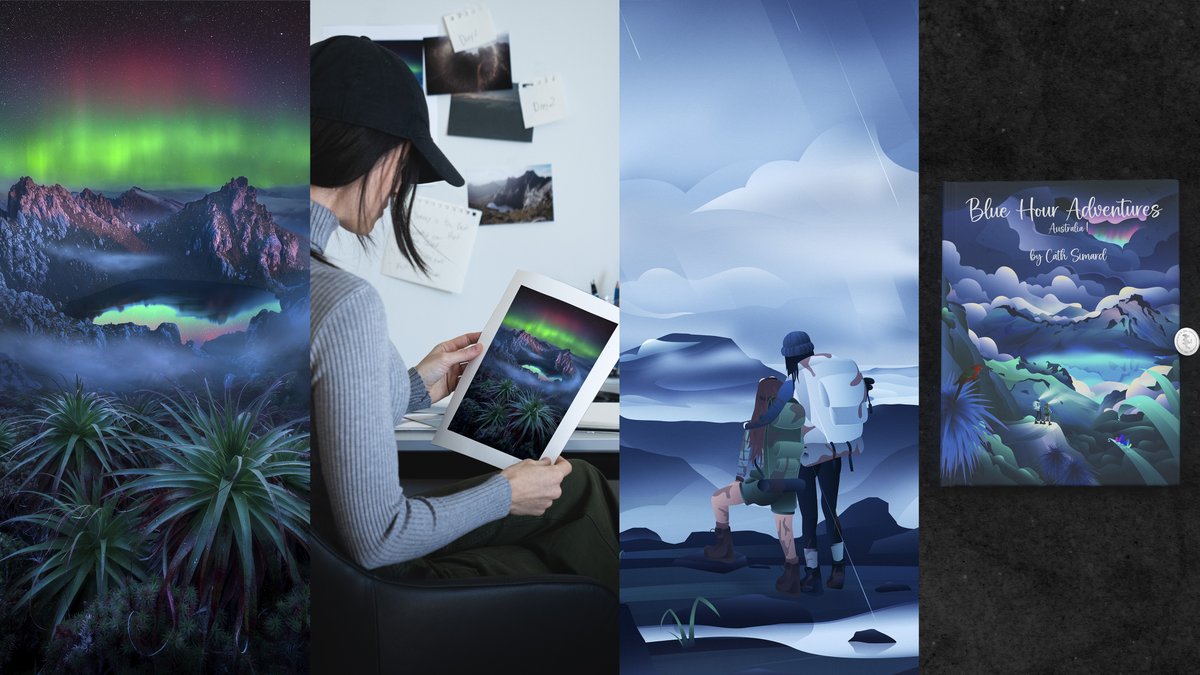
@redbeardnft also suggested we look at Cath Simard's last drop, which also has an amazing video "trailer":

Introducing "Blue Hour Adventures: Australia!", my first children’s book & dive into the world of youth.
A fictional tale based on my trip in Tasmania, meant to inspire the younger generation.
An exclusive collector's package including the book & the art.
All details below
A fictional tale based on my trip in Tasmania, meant to inspire the younger generation.
An exclusive collector's package including the book & the art.
All details below
I don't think it's a good match because it isn't multiple 1/1s on auction but rather an edition of 444 with a physical too.
This highlights the need for a better repository of artist works and tools to compare/improve. (do I work on this ? maybe 😁)
Now my last point is on the drop timing. Obviously, this is (again) a really difficult topic.
My first hunch is that the summer might not be the best time to drop a project.

The current market is terrible, and the few people who do have the funds are looking at other things like Solana memecoins, Bitcoin Ordinals, etc.
They're not specifically looking at Ethereum NFTs. and especially not at 1/1s.
But again, finding the right time to do a drop is going to be difficult.
Sure everybody aims for Wednesday/Thursday, But finding the right macro time is much harder.
I'm actually creating a tool to help artists schedule their drops using their collectors activity (what an amazing tool it is ! 🤤 ) let me know in the comments if you're interested.
🫡 Alright that's it for this case study. Dave Krugman is a very interesting artist, and I'm super inspired by his approach to marketing the project.
I hope you liked my take on how to improve using his work as reference !
See you next week ✌
Nahiko
If you enjoyed this issue, please tap the Share button below ❤️ Thank you!
I share 1 new thing I learned in the NFT space, every week ✨ Don’t miss the next one:

Subscribe to Nahiko's Bookmarks
Over 100 subscribers
A weekly curation of my Twitter Bookmarks mailed directly to you every Thursday