With the latest integration of Vega Charts, users can now plot simple and sophisticated charts with customised data or pair it with their existing datasets!
Plotting Charts
Plotting charts on Pureflex is straightforward as native Vega configurations can be used to prepare the charts and the required data format remains the same as is found in the Vega examples. Users can benefit from the large existing knowledge-base of Vega Documentations.

Sample chart: A binned scatter plot example showing aggregate counts per binned cell.
Charts Data & Your Datasets
Pureflex allows 3 methods of using data on charts including:
use of dynamic data created during the application runtime
use of existing datasets
use of remote datasets through URL
To read more on how data can be used on your charts, head to our documentation at: https://docs.pureflex.app/coding-with-pureflex/chart-visualisations
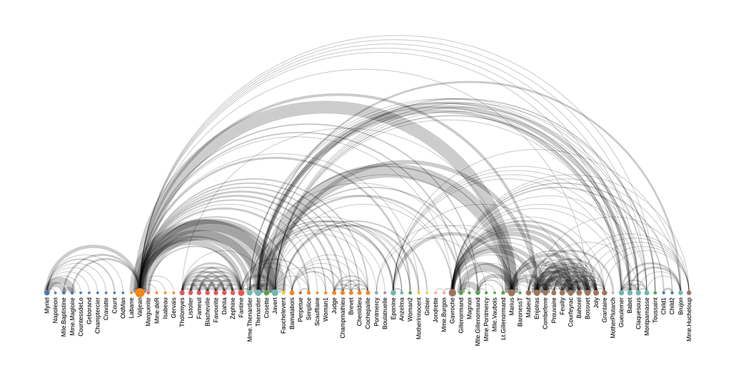
Sample chart: An arc diagram depicting character co-occurrence in the novel Les Misérables.
Charts Viewer
The improved Resource Viewer allows for convenient display of plotted charts as well as other files in your application. The Viewer canvas itself can be adjusted and its contents re-scales to match the new size.
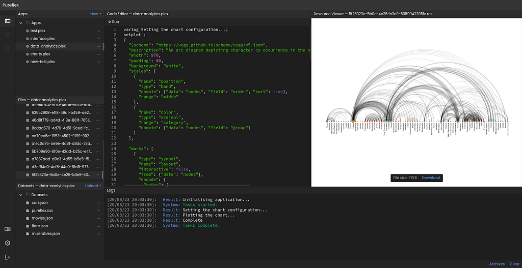
The improved File Viewer displays charts.
Checkout Vega
To read more on Vega charts, head to https://vega.github.io. We are thankful for all the contributors of Vega and for providing their product for us to use. The Vega website offers documentations as well as examples for everyone to check out.
We are proud of our consistent progress in delivering new features to the platform and our plan is to do more. Thank you for your time reading our news article. If you’re interested in trying out Pureflex, please head to https://pureflex.app and join us on Early Access!
Questions?
We would love to hear your thoughts on our product. Let us know on contact@pureflex.app
